Dealing with 2D numerical data
January 22nd, 2019
Data Science: Techniques and Applications (DSTA)
Plan for the lab
Background discussion.
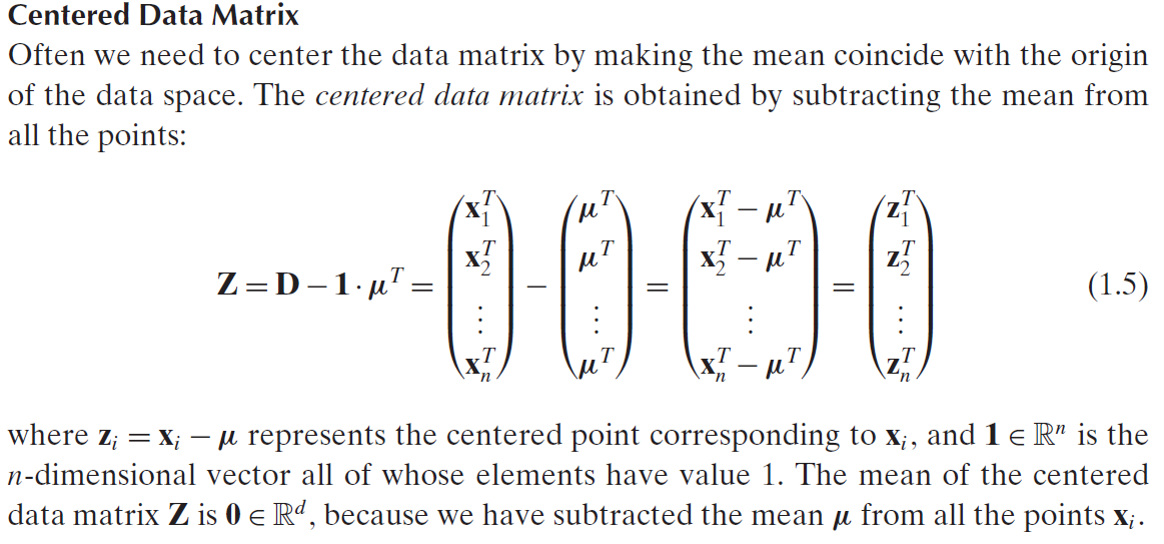
Exercise-1: Calculate a centered data matrix.
Exercise-2: Plot histograms.
Exercise-3: Scatter plot.
Discussion related to wine dataset and pandas.
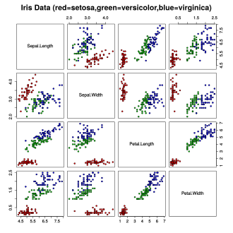
The iris data-set
peek into iris.csv
- Has three classes: Setosa, Versicolor and Virginica.
Loading the Iris dataset
The Iris dataset normally comes as a comma-separated csv file.
one specimen per row
Each row has values of sepal length, sepal width, petal length, petal width.
Use built-in csv function to create numpy array that can be iterated.
Convert (cast) class column to represent integers instead of strings.
import csvFILE = 'iris.csv'with open(FILE, 'r') as mycsvfile: dataset = csv.reader(mycsvfile, delimiter='.', quotechar='"') for row in dataset: #py 2: print ', '.join(row) #py 3: print(row, sep=',')Interest for Data Science
- given the annotated dataset, can we measure differences in average measures?
. . .
- can difference in size become a classifier?
. . .
Please see the Kaggle notebook
Homework:
- Develop your solution for measuring
mean of the dataset and
variance in each dimension.
How are they defined on multi-dimensional data?
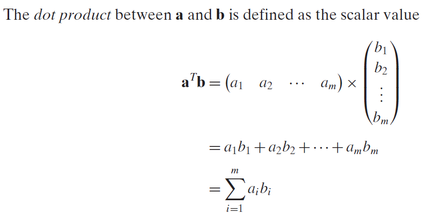
Background: Dot product

Background: Norm

Mean

Variance

with Numpy
import numpy as np data = np.arange(6).reshape((3,2))print(data)print(np.average(data, axis=1))print(np.average(data, axis=0))Centering the dataset

Exercise 1
Use iris_centered_matrix.py for this exercise.
Later, a solution will be available as file iris_centered_matrix_solution.py
Visualisation
Histogram
- A graph consisting of rectangles whose area is proportional to the frequency of a feature and whose width is equal to the class interval denoted as bins.
Scatterplots
A 2D visualization of datapoints against Cartesian coordinates.
Normally, the measured variable is on the x-axis.
if time is available then it is always on the x-axis.
A plot function in python
def histogram_sepal_width(data): # create an empty figure object fig = plt.figure() # create a single axis on that figure ax = fig.add_subplot(1,1,1) # todo: histogram the data and label the axes ax.set_xlabel("Change me please") ax.set_ylabel("Change me please")Visualization exercise:
- Use iris-baseline.py for the following exercises.
Exercise 2
- Plot a histogram of the sepal width column.
Exercise 3
- Scatter-plot Sepal length Vs. Sepal width
- Later, a solution will be available as file iris-plotting.py
